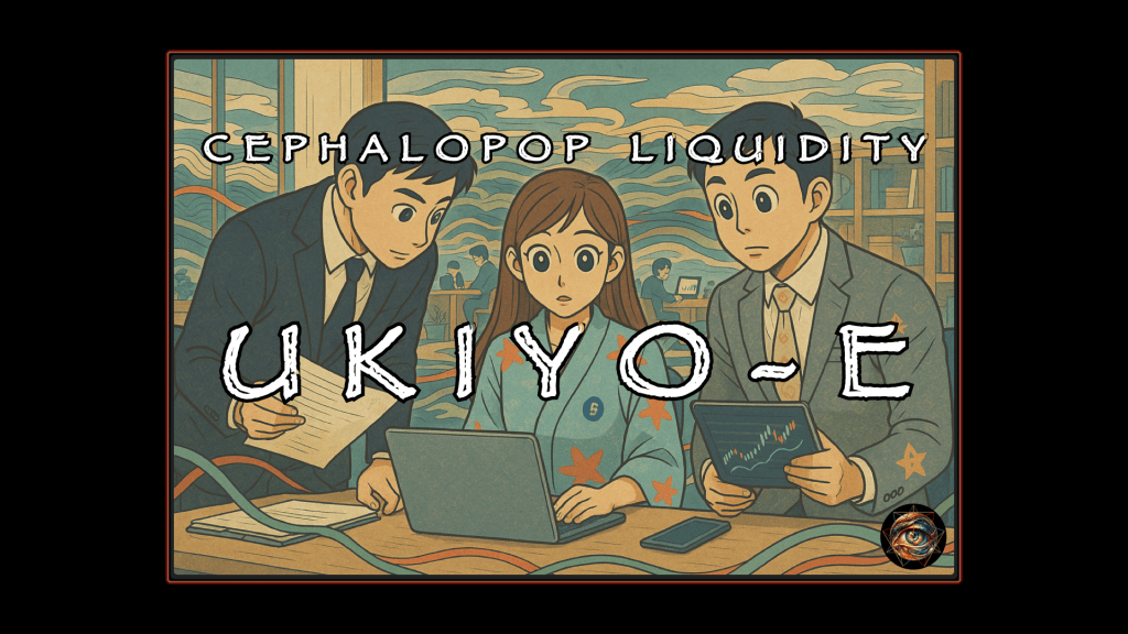
Office-core in the Floating World: Antique Patina, Modern Panic
Picture a thumb hovering over a feed like a metronome. Tick. Tick. Tick. Every beat is a rejection, a tiny auction where the currency is attention and the bidders are strangers with better lighting. In that market, “quality” means nothing. “Truth” means less than nothing. Recognition wins. Intrigue wins. Discomfort wins hardest, because discomfort has an aftertaste.
A style like this does not need to be defended, but understood. That starts with the admission that nobody is immune. The eye wants what the eye wants. Patina makes it feel safe. Cute faces make it feel human. Office props make it feel legible. Curving motifs make it feel alive. The viewer thinks they are clicking on content. The viewer is clicking on a sensation: competence inside nonsense, calm inside catastrophe, professionalism inside a room that keeps filling with tidewater.
The style looks like it should be hanging in a climate-controlled museum room, guarded by a docent who hates you. Ukiyo-e brings instant authority: disciplined line, flat color blocks, waves that feel like handwriting, clouds that feel like graphic design. The eye reads it as artifact before it reads it as image. Artifact implies value. Value implies attention. Attention implies you owe it a second longer. A second longer becomes a click. A click becomes a habit. Habits become religions.
Modern office props slide in under that antique varnish like a briefcase under a table. Laptop glow. Price charts. Desks. Paper stacks. Conference-room geometry. The scene declares its category without asking permission: finance, work, bureaucratic ritual. The viewer understands the setting in half a heartbeat, which buys you the right to get weird in the other half.
The weirdness arrives politely.
A hybrid anime face appears, clean and legible at thumbnail scale. Big eyes, tight mouth, rounded cheeks, slightly uneven ink outlines. The face is not just style; the face is a delivery system. The face says “human,” which disarms the viewer long enough to let the room become impossible. Empathy is the lubricant. Empathy is the trap.
Then the liquidity motifs drift in.
Tentacles, except nobody says tentacles out loud. Curves. Ribbons. Currents. Data streams. Decorative wave-forms that behave like the market’s handwriting. The trick is restraint. Nothing grabs. Nothing wraps. Nothing crosses the line that triggers a report button or a guilty conscience. The motifs stay just shy of touch, which is exactly where the nervous system starts doing the work for you. Suggestion becomes participation. The viewer supplies the pressure. The viewer completes the contact.
A starfish motif appears occasionally, geometric and tasteful, living on a shoe strap or a charm like a corporate joke told with a straight face. The symbol sits where the eye can find it later, after the click, after the zoom, after the “wait, what is that.” Discovery becomes reward. Reward becomes stickiness. Stickiness becomes repeat viewership. Repeat viewership becomes “community,” which is a polite word for attachment.
The humor lives in the character’s calm.
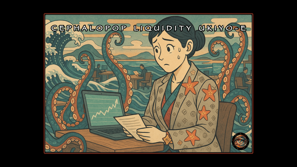
The face stays focused, faintly bemused, professionally unbothered. That calm is the punchline and the menace. A chart line spikes like a tsunami and the character reacts like someone in a quarterly review. The ocean climbs the walls and the posture stays composed. Corporate culture loves catastrophes as long as the deck has consistent fonts. Finance loves apocalypse as long as the candles look symmetrical.
That is the temperature. Heat comes from contradiction, not skin.
A safe-for-work image can still feel indecent. Indecency can arrive through implication, through proximity, through the quiet sense that the room is watching you while you pretend the room is not alive. Cephalopop Liquidity Ukiyo-e treats liquidity like a creature that learned manners. The creature never touches you. The creature never needs to. The creature only needs to be present, coiled through the scene like a thought you cannot swallow.
A cultural tension sits underneath the gloss, too. Ukiyo-e is not a wallpaper pattern; ukiyo-e is a grammar. The style works when that grammar remains structural: composition that pulls the eye along diagonals, palettes that stay warm and muted, lines that feel printed rather than rendered. The style fails when “Japan” becomes a texture pack tossed on top of a generic scene. Intention reads. Tourism reads faster.
A practical secret sits underneath the craft talk. The method is reproducible. A reference photo supplies bones: pose, silhouette, gaze direction, a human rhythm that keeps the output from turning into pure dollhouse. The prompt supplies the world: antique print logic, office props, resort-surreal bleed, gentle lighting, controlled accents. A correction pass supplies discipline: less clutter, fewer symbols, tighter palette, cleaner shapes, more negative space, more “print.” That correction pass is where the mood sharpens. Mood always sharpens in editing.
A viewer does not need to know any of that to feel it.
A viewer only needs to sense a familiar office scene rendered in a language that feels older than their anxiety, then notice the anxiety has been rebuilt as décor. A wave echoes a chart. A cloud echoes a flowchart. A conference table feels like a shoreline. The shoreline feels like an asset class. The room feels like a resort that hosts layoffs. The character smiles like a compliant employee completing mandatory training titled “Volatility Events: A Fun Team Exercise.”
That is why the style performs. Performance is not an accident. The feed rewards images that behave like puzzles and punish images that behave like explanations. A Cephalopop thumbnail is a puzzle that pretends it is a product. The puzzle invites the viewer to resolve the contradiction: antique legitimacy plus modern grind plus politely hungry ocean. Resolution never arrives, which keeps the viewer in the loop. The loop is the product.
Enthusiasm belongs here, too, because this is a laboratory of aesthetics.
A reader can run the experiment and watch their own attention respond. A reader can swap the character role and watch the tone mutate. A reader can push the palette warmer and feel the image become more “trustworthy.” A reader can simplify the background and feel the creep intensify. A reader can reduce the symbols until they vanish at thumbnail scale, then reappear on zoom like a private joke. That zoom moment is dopamine with manners.
A final detail matters. The creep must stay subtle. Subtle creep is sustainable. Subtle creep scales. The line should remain un-crossed, not because morality lives there, but because performance does. The feed punishes explicitness with boredom. The feed rewards implication with obsession.
A thumbnail can become a small haunted object that sells itself.
That is the whole game.
Liquidity Waves Need No Consent: A Woodblock Print Ate Your Portfolio
The internet does not reward truth. The internet rewards recognition. A thumb twitches before the frontal lobe finishes booting, so an image has to hit like a flashbang. Familiarity buys the first click. Confusion buys the second click. Shame buys the rewatch.
Cephalopop Liquidity Ukiyo-e sits in that profitable third category. The look does not aim for beauty. The look aims for adhesion. Modern office cosplay, crypto ornamentation, and brand-safe “girl-boss” staging get laundered through the authority scent of a faux antique Japanese print. The result reads like a late-19th-century woodblock that wandered into a Bloomberg terminal, got issued a badge, and started pretending spreadsheets were weather maps.
Patina does much of the work.
Ukiyo-e arrives preloaded with craft. Flat planes. disciplined line. controlled palette. stylized clouds that behave like graphic design rather than atmosphere. The viewer’s brain tags the whole thing as “artifact,” which the feed tags as “valuable,” which the nervous system translates as “look longer.” The office props arrive next and do the opposite job. Laptop. chart. meeting room. document. The scene declares its genre in half a second. Finance. Work. Bureaucracy. Adult daycare with quarterly targets.
The hybrid anime layer functions as a compliance hack. Large eyes and tight mouths read cleanly at thumbnail scale, so the character becomes legible even when the scene turns surreal. Empathy arrives early, which allows the image to get stranger without losing the viewer. That is the trick: a controlled hallucination that still feels readable, like a user interface for panic.
The creepiness lives inside the restraint.Tentacle motifs never “do” anything overt. Tentacle motifs behave like ribbons, currents, or data streams. Suggestion stays just shy of contact. The market becomes the cephalopod: everywhere, curved, patient, and indifferent to personal narrative. Liquidity becomes a tide that smiles while it climbs the drywall. Horror shows up as atmosphere, not anatomy.
The funniest part comes from the character’s face. Calm. Focused. Slightly bemused. The expression says the meeting is pointless, yet attendance remains mandatory. That serenity is the real unease. A chart spikes like a tsunami and nobody screams. Everyone sips boba and nods. Corporate culture loves a disaster as long as the slide deck looks polished.
The style also borrows “East Asia” as a texture pack, which deserves acknowledgement without a moral panic. The approach works when ukiyo-e functions as structure rather than decals. Composition and palette carry more weight than props. Line discipline matters more than random wave stickers. Intention shows. Tourism shows faster.
Boba, Bloomberg, and the Octopus God: Tentacles as Risk Management
Readers who want to experiment do not need a design degree, but a workflow.
Step One: Start with a Photograph
A reference image gives the model bones: pose, silhouette, gaze direction, and human rhythm. A clean subject with readable body language helps. A person leaning over a desk, reacting to a screen, presenting a document, or staring into the middle distance like a debtor at a seafood buffet works well.
Step Two: Runs the Style Prompt
The ask remains specific: asymmetric 16:9 composition, antique woodblock feel, modern finance props, warm muted palette, and controlled surreal motifs. Discipline matters more than novelty. Surrealism works best when the world follows rules while the rules quietly imply doom.
Step Three: Edit the Output
First drafts always under- or over-reach. Symbols get too literal. Lighting turns neon. Backgrounds fill with nonsense. Hands become haunted crab spoons. The fix is not “argue with the model.” The fix is editorial triage: reduce noise, preserve narrative, sharpen intent.
Correction moves that raise quality and raise creep without crossing lines:
A background needs fewer objects and more negative space. Two or three key props carry the story. Clutter kills the print illusion.
The era needs enforcement—paper grain, slight washout, muted pigments, zero glossy sheen or modern plastic glare. The symbols need demotion—monogram scale only, decorative texture at thumbnail scale, no floating logos, no billboard crests.
The waves need intelligence. Currents should frame the subject and echo chart geometry. Contact stays off-limits. Suggestion stays midground.
The emotion needs calibration. Calm focus with a hint of bemusement reads sharper than seduction. Controlled dread lands better than panic. Instruct the model to render any specific feelings you intend to project into your story.
Don’t forget those starfish, either.
The creepiness should ride on serenity. A wave pattern can mimic the price line. Clouds can resemble flowcharts. Silence can feel too clean. The room can feel like a resort that hosts layoffs.
Heat does not require skin, but implication. The office becomes a shoreline. The shoreline becomes an asset class. The ocean climbs the walls while the character smiles like a compliant employee completing a mandatory training module.
The feed loves that contradiction. A bureaucratic panic attack becomes a collectible antique. Volatility turns into décor. Anxiety becomes a brand. Metrics applaud. Morals stay absent.
Experimentation should stay playful. Mutation should stay intentional. A first output that looks too cute can be pushed darker through structure rather than shock. Palette can mute further. Background can empty. Lines can sharpen. The curve motifs can tighten into a net. The expression can stay calm while the room becomes impossible.
That calm expression sells the joke and sells the dread. A face can whisper “this is fine” while the ocean signs the timesheet.
Here are correction moves that reliably raise quality and creep without going explicit:
- Reduce clutter: Simplify background figures; fewer objects; more negative space; keep only 2–3 key props.
- Tighten the era: Make it look like an aged woodblock print; slightly washed; paper grain; muted pigments; no modern glossy sheen.
- Control the symbols: Monogram-scale only; no floating logos; patterns read as texture at thumbnail size.
- Make the waves smarter: Tentacle motifs behave like stylized currents/data flows; frame the subject; do not touch the body; remain midground.
- Upgrade the emotion: For example, select calm, focused, faintly bemused—like someone who knows the meeting is pointless but attends anyway—or the opposite.
- Creepiness via serenity: Add subtle surreal unease: a wave pattern echoes the chart line; clouds resemble corporate flowcharts; the room feels slightly too quiet.
The Prompt: How to Make Finance Look Like a Museum Exhibit
A 16:9 cinematic illustration in the “Cephalopop Liquidity Ukiyo-e” style: a [CHARACTER / ROLE] in modern business attire inspired by traditional Japanese clothing, positioned asymmetrically (usually on the right side of the frame, facing toward the center), in a surreal office / financial setting that subtly merges with an ukiyo-e inspired land and sea scape. The visual style is a hybrid of Edo-period ukiyo-e woodblock prints and clean modern hentai-style anime: bold, round faces and large eyes, tight mouth, slightly uneven ink-like outlines; mostly flat, graphic shading with 1–2 hard-edged tones; minimal soft gradients.
Color Palette: warm, earthy, and muted ukiyo-e tones (indigo, deep teal, vermilion red, ochre, warm beige, smoky purple) with a few controlled, saturated financial accents (BNB yellow, crypto greens, digital cyan highlights). Lighting is naturalistic and soft, with gentle contrast and no harsh neon glow … slightly washed out, like an old print from a woodcut. The finished product should appear to be late 19th century (i.e. anachronistic).
The character’s outfit is modest and fully clothed: a tailored blazer, skirt, kimono-inspired layers, or office wear with tasteful details. Fabric patterns quietly incorporate small, repeating financial symbols and crypto iconography (Bitcoin ₿, Ethereum diamond, BNB geometric emblem, plus subtle ¥ and $ signs) arranged as decorative monograms or crests, never as giant floating logos. At thumbnail scale, the patterns read as texture, and only resolve into symbols on closer inspection.
The environment jarringly blends open-plan office furniture with luxury resort (hotel room/bar/spa/sauna) and financial tools (desks, laptops, monitors, w/ price charts) with stylized ukiyo-e elements: layered flat clouds, wave-like shapes, abstract mountains, and ocean-like flows that double as liquidity waves. Background figures, if present, are simplified, low-detail background workers, partygoers or clerks posed like tiny ukiyo-e characters, busy at desks or screens.

MOTIFS
- Tentacle motif: curved, ribbon-like shapes inspired by cephalopod tentacles flow through the scene and around objects, but they remain clearly graphic and non-organic, more like stylized waves or data streams. They do not touch, wrap, grab, or interact with the character’s body in a suggestive way; they remain background or midground design elements.
- Sea Star Liquidity motif (only on the lady): stylized five-point starfish shapes, treated as decorative geometric elements rather than living creatures. They appear as fabric pattern elements, jewelry charms, or a sculpted sandal or shoe strap. If feet or footwear are visible, they appear incidentally as part of a full-body or mid-shot composition, not as the focal subject: a star-shaped strap or ornament across a normal sandal, with a tiny BNB symbol or other coin emblem in the center, rendered modestly and without fetish framing.
Composition: strong diagonals and flowing curves lead the eye from the character’s face to key props (documents, screens, charts), then out through the liquidity motifs. The character’s facial expression is focused, calm, slightly bemused or determined—more professional than seductive. Body language is dynamic but non-sexual: sitting, standing, leaning over a desk, gesturing toward charts, or reacting to data with controlled emotion.
Overall tone: surreal and risqué, but safe-for-work, business-casual and narrative-driven, with subtle humor, irony and innuendo. No explicit nudity, no exaggerated anatomy, no erotic context. Marine-inspired shapes and financial motifs function purely as symbolic, graphic design elements that support the story of finance, liquidity, and bureaucracy in a floating-world/hentai-inspired, crypto-era office.


Leave a comment